MONTREUX — SWITZERLAND
Prospert is a financial education centre that helps millennials build confidence, take action, and develop long-term financial habits.
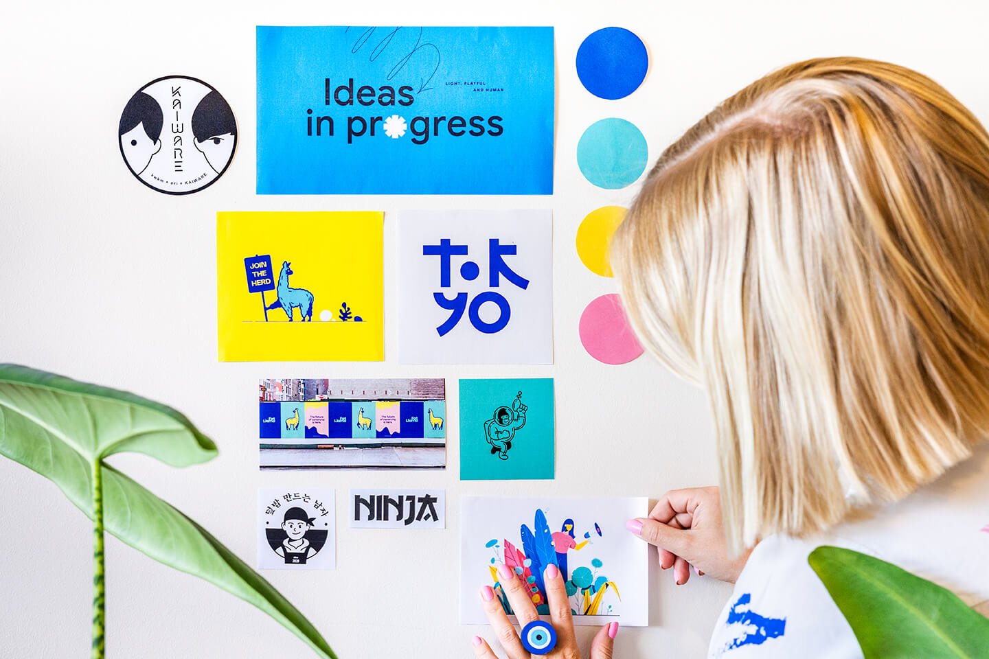
Neutral and independent, the platform offers workshops and courses with practical advice tailored to individual situation covering budgeting, strategy, and safe investing. Prospert approached Release The Zebra to develop its visual identity. The core challenge was to transform a subject often perceived as intimidating or boring into an engaging and motivating experience.
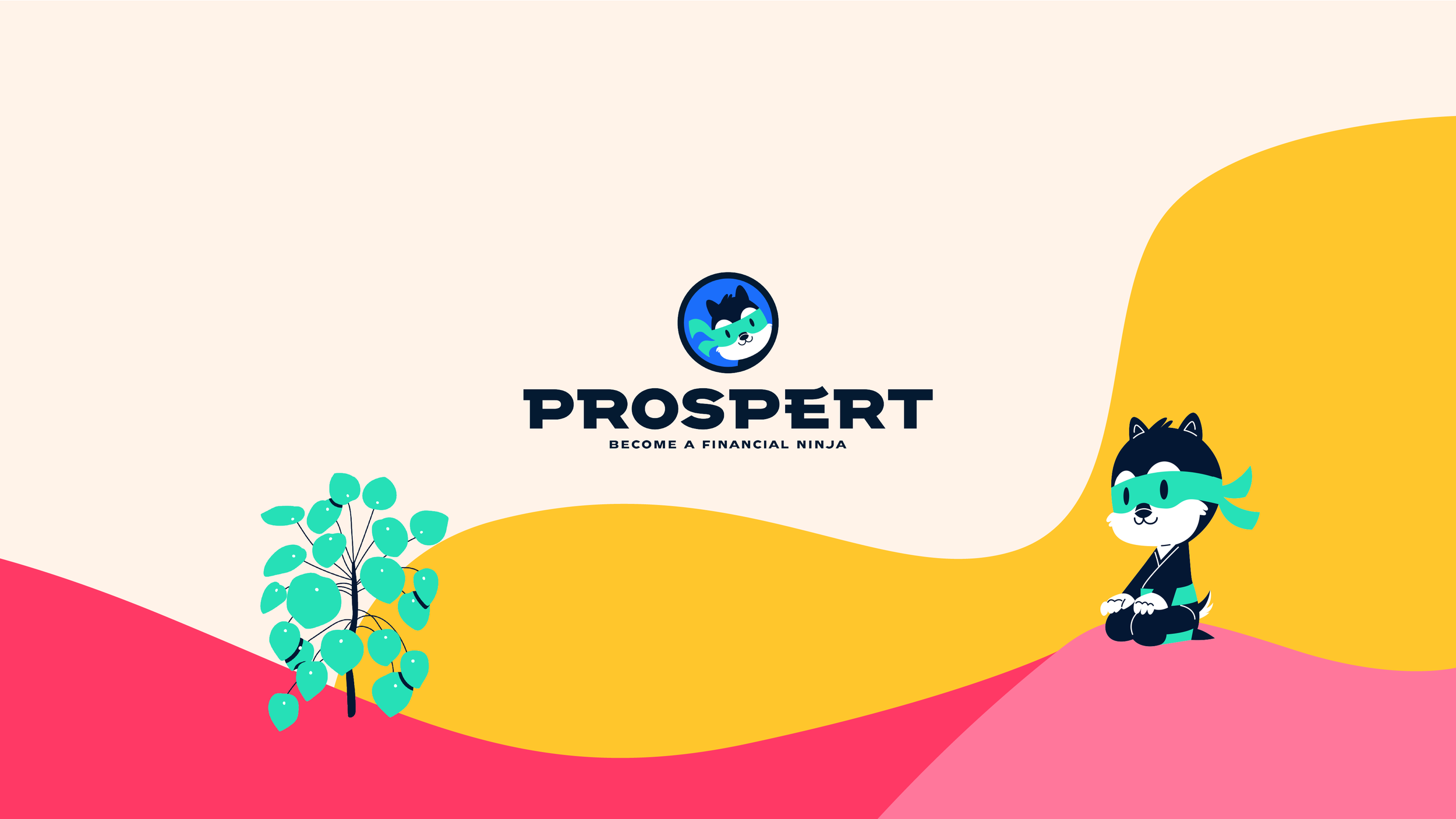
We reframed finance as a skill that can be learned through practice rather than something abstract or inaccessible — more sport than rocket science — leading to the central promise of becoming a financial ninja. To bring this idea to life, we created a mascot that acts as a friendly guide throughout the learning journey, similar to the supportive role played by Duolingo’s owl. The chipmunk was chosen for its natural association with planning and resource management, while the ninja reference reflects the discipline, balance, and consistency required to build strong financial foundations. Rather than conveying conflict or aggression, the character embodies self-control, focus, and progress. Illustrated in a range of expressive poses, the chipmunk cheers, guides, and celebrates milestones alongside users as they advance.
Client: Prospert
Year: 2021
Services:
Art Direction
Brand Identity
Creative Strategy
Character Design
Illustrations
Digital Design
Publication Design


The wider graphic universe was built to reinforce this sense of balance and wellbeing. Supporting illustrations draw from plants symbolising prosperity (such as Chinese money plant) while soft, flowing landscape curves create a calm and reassuring environment, helping counter the anxiety often associated with financial topics. Typography played an important role in reinforcing the concept. The custom wordmark was designed with subtle elements of gamification and light Japanese influences, echoing the ninja theme while remaining clean, contemporary, and highly legible across digital touchpoints.


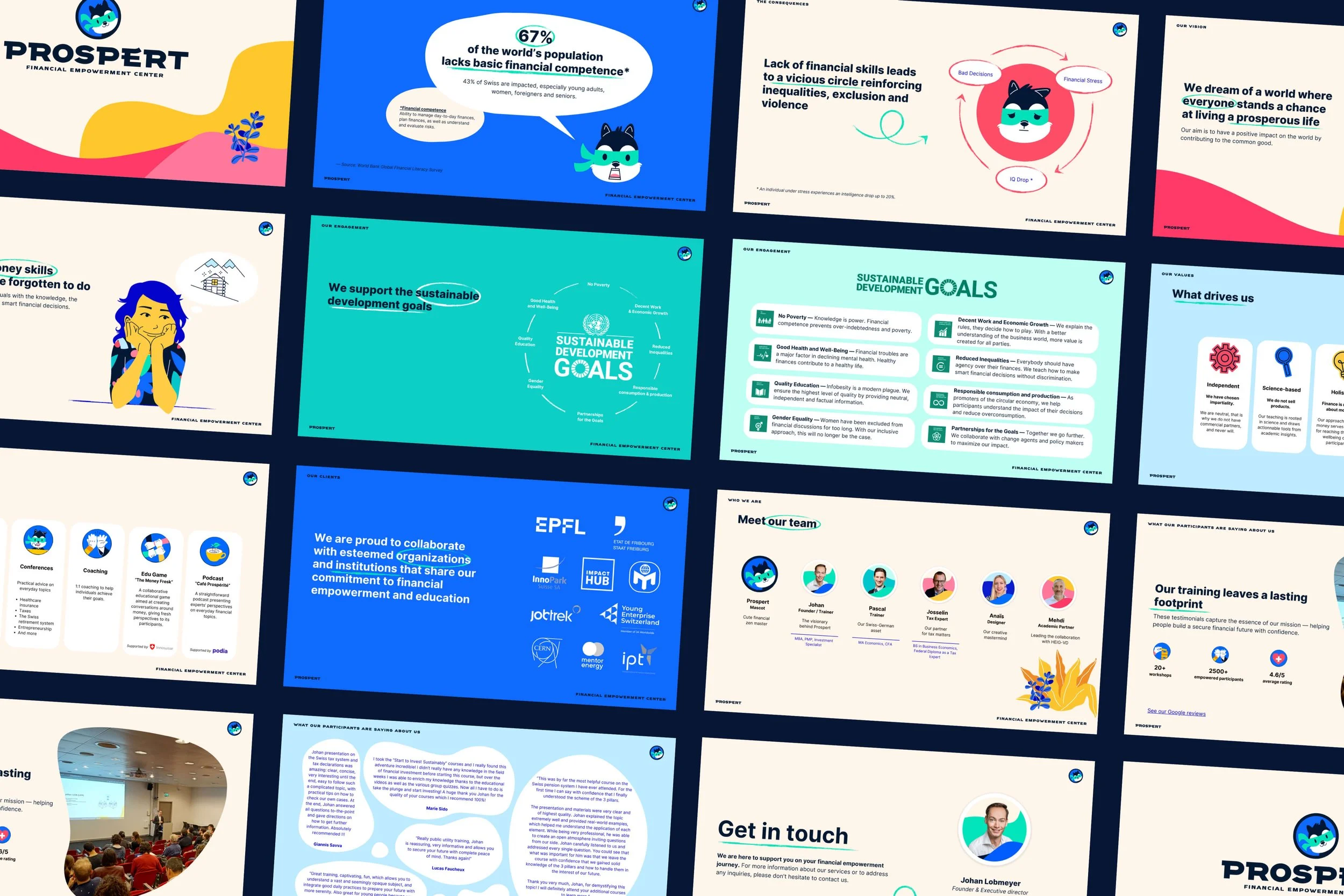
Custom illustration was central to the system, allowing complex financial ideas to be communicated in a simple and approachable way. This helped make educational content more digestible, reinforced Prospert’s friendly brand personality, and humanised the experience for users.
The colour palette was inspired by financial industry conventions while introducing warmth and energy. Blue establishes trust and stability, green reflects balance, growth, and sustainable financial outcomes, while yellow and pink add optimism, energy, and kindness mirroring the supportive community Prospert aims to build.
Once established, the visual identity was rolled out across the website, social media, and online presentations, creating a cohesive and engaging brand experience at every touchpoint.


“It is my 3rd project with Release The Zebra and they keep nailing it. Anaïs is fun to work with, and the result is always amazing. They get deeply interested in the subject at hand, come up with creative and relevant ideas, and deliver like a boss!”
— Johan Lobmeyer, founder