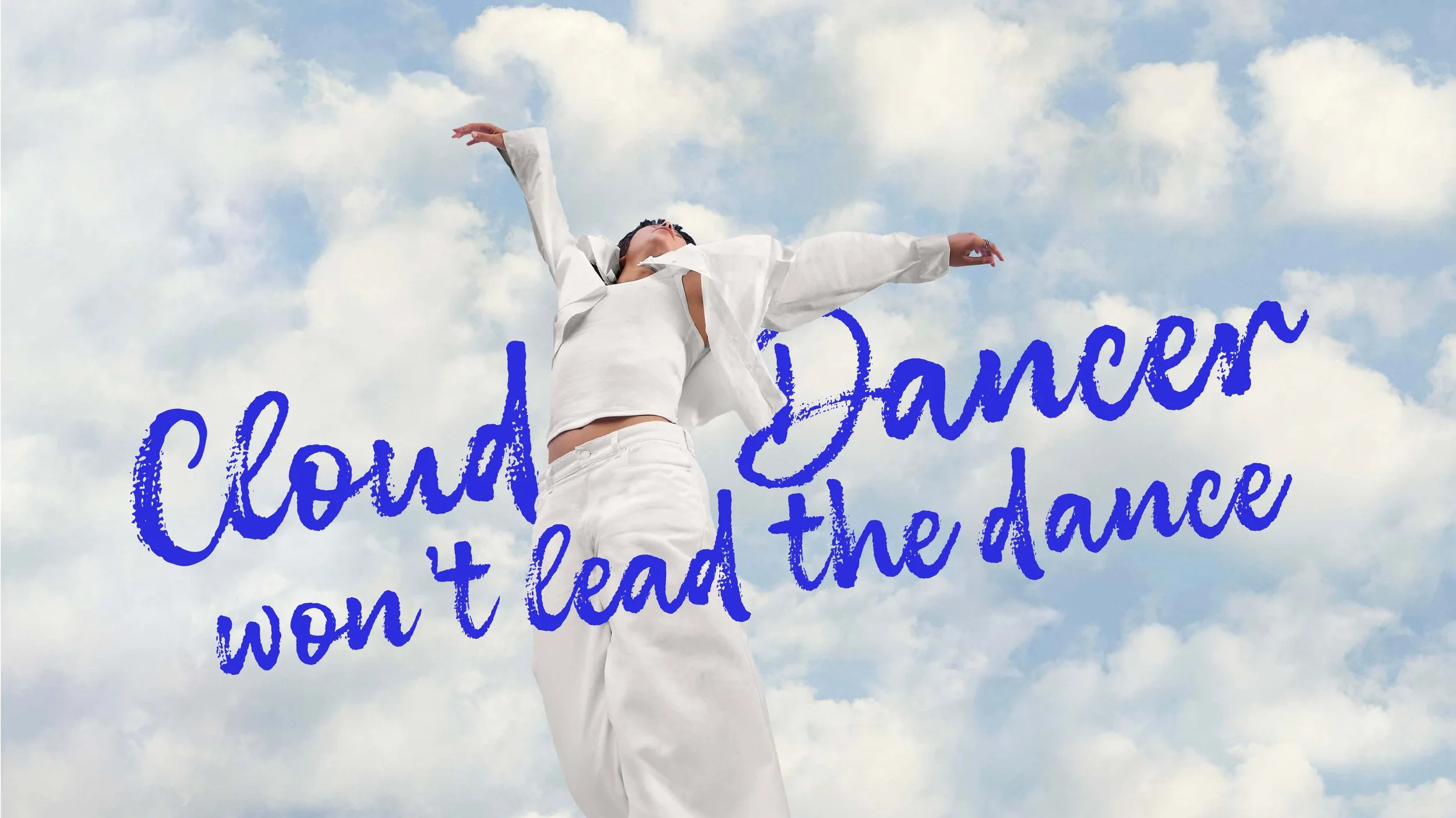
Why we’re choosing colour over Cloud Dancer
Pantone released its Colour of the Year for 2026 a month ago. I didn’t rush to comment on it, partly because everyone already had something to say, and partly because I needed time to sit with it. To process it. To understand what it meant for the year ahead before letting disappointment (or rage) write the article for me.
For the first time since 1999, Pantone announced a soft, airy off-white. Cloud Dancer. And honestly? I felt… nothing.
A quick reminder: what is Pantone, really?
For those less familiar, Pantone is a colour reproduction system that provides a universal language for colour. You’ve probably seen a PMS code in brand guidelines delivered by a designer, that’s Pantone.
Its role is essential: it ensures consistency across materials, industries, and mediums, from graphic design to fashion and manufacturing. It removes subjectivity from colour interpretation which is helpful, especially if you’ve ever tried describing a colour verbally to someone else (or played Hues and Cues with a very confident but very wrong partner… huge frustration on my end, haha).
Beyond standardisation, Pantone also selects a Colour of the Year, meant to reflect global cultural moods and influence design trends across industries. And for 2026, that colour is… white.
Cloud Dancer: calm, clarity… and boredom
Pantone describes Cloud Dancer as lofty, soft, airy, and gentle, symbolising calm, fresh starts, and clarity. A blank canvas in a noisy world. I understand the logic. I really do. But emotionally? Creatively? It leaves me completely cold.
White is presented as neutrality, as space, as possibility. But for me, it reads more like withdrawal. Silence. A refusal to take a stand. And in a world that feels increasingly tense, divided, and uncertain, that choice feels deeply uninspiring.
When neutrality feels like disengagement
Colour is not neutral. It never has been. Colour communicates emotion, culture, identity, values. Choosing colour is choosing to say something. And choosing not to, especially from an institution with as much influence as Pantone, is still a statement.
Fashion labels, product designers, creative studios, and brands across the world will look to the Colour of the Year as a signal. It shapes collections, campaigns, and visual languages. That influence carries responsibility. In a moment where so much feels fragile, heavy, or urgent, opting for near-invisibility feels like an invitation to retreat rather than respond.
Colour as expression, not decoration
At Release The Zebra, we believe colour is a form of expression. A way to communicate emotion, energy, and intent. As designers, we don’t exist in a vacuum. Our work responds to the world around us. And right now, the world doesn’t need less feeling, it needs more humanity, more warmth, more courage. Choosing colour can be an act of optimism. Of resistance. Of care.
In our work, colour is used intentionally to support storytelling, to create emotional connection, to make ideas accessible and memorable. We embrace contrast, vibrancy, and personality because they reflect life as it is: complex, imperfect, and full of feeling. So no, we won’t be surrendering to white.
In 2026, Release The Zebra will continue to create colour palettes that celebrate life, individuality, and expression. Because with everything happening in the world right now, I truly believe we need more colour, not less.